Pre-Press Printing Advice
Clear Text (Safe) Area
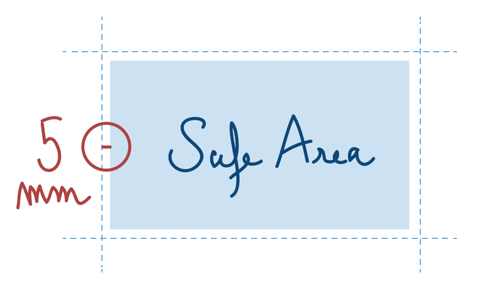
It’s a sensible idea to design your documents a safe distance away from the edge of the page to avoid text being chopped off during finishing. We recommend a distance of at least 3mm from the edge on all jobs and 5mm on perfect bound documents. This rule also applies to page numbers.
Fonts
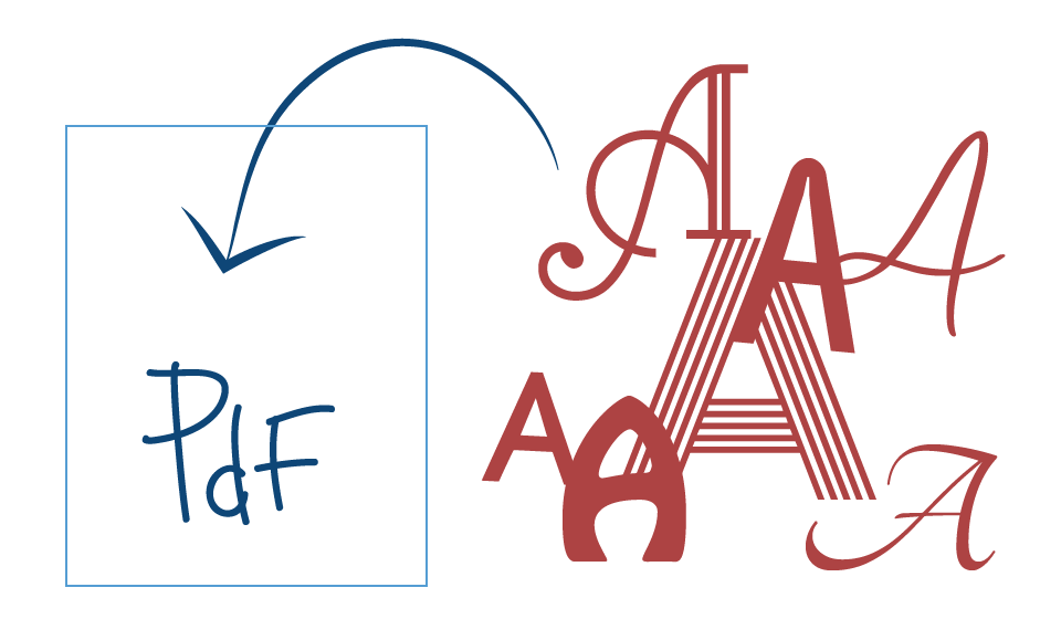
Embed all fonts within the Pdf document by checking the embed fonts check box when producing your job. Otherwise if you are suppling the native file to us (i.e. Indesign™, Word™ etc.) please also supply the fonts that you have used.
Images
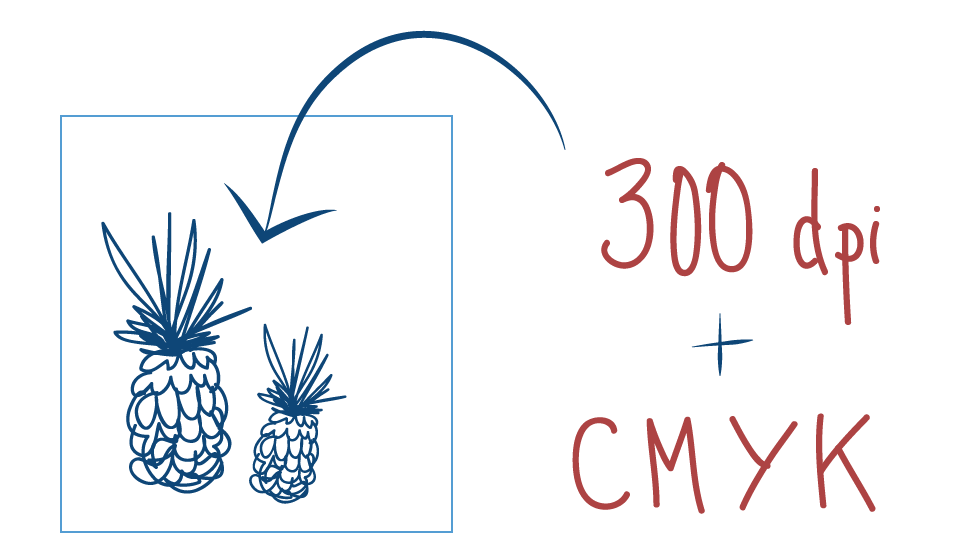
Images should be at least 300dpi and CMYK (Cyan, Magenta, Yellow and Black). All line art images to be 1200dpi placed at 100%. Avoid using multitone images, instead convert them to CMYK, unless you’re doing spot colour work.
Page Size & Printer Marks
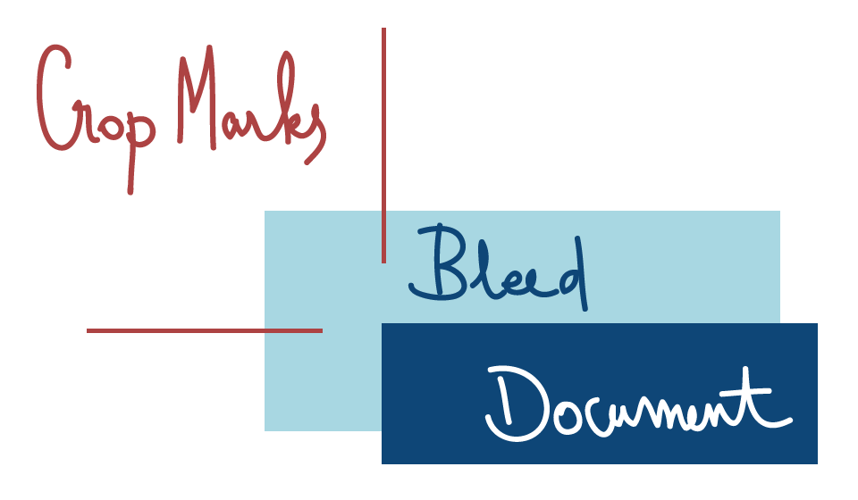
Please supply your artwork at actual size, apart from when producing large format material like banners and pop-up display stands, they can be supplied at quarter size. If your document is designed to print right to the edge of the page, please supply adequate bleed of 3mm or more and include crop marks to show trimmed size. Pages should also be supplied in running order and not in spread format or printers pairs. The only exception is front and back covers for books with a spine.
Colours
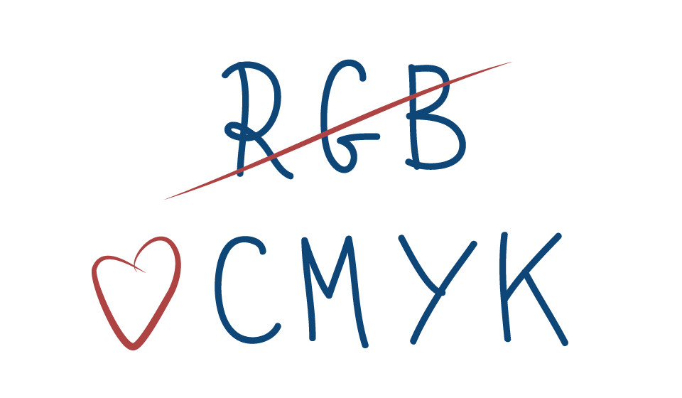
If you are creating artwork for 4 colour (CMYK) printing then please make sure all colours used within the document (including linked graphics like illustrator files) are all in this colour space. Please do not supply RGB colours as they will appear very flat and dull looking. If you are preparing artwork for spot colour work (i.e. Pantone colours) please make sure your document only contains one version of the Pantones you wish to use. Please avoiding having duplicate Pantones like Pantone 233C with Pantone 233CVC as they will produce two separate plates.
Maintaining Legible Type & Strokes
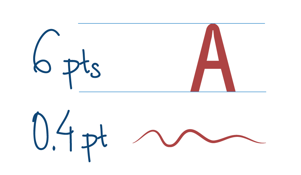
One typical mistake in design is the use of type or strokes/hairlines that do not print well and thus wind up being illegible. To avoid this mistake, shy away from type sizes smaller than 6 pts and lines (rules) thinner than 0.4pt. Type smaller than 6 pts becomes difficult to read anyway, and finer details may be difficult to hold on the press without breaking up or filling in. Typical body copy should run between 9 and 12 pts in size for maximum readability. Be careful when using “reversed out” copy (ie: text that is a light colour running across a darker area). Because the darker area tends to bleed into the lighter text area on the press, it is recommended that you use at least 6 pt type, and sans serif fonts, in these instances.
Paper size
This is a list of the most common paper sizes we stock and run on our machinery
A Sizes
A0 841 x 1189 mm
A1 594 x 841 mm
A2 420 x 594 mm
A3 297 x 420 mm
A4 210 x 297 mm
A5 148 x 210 mm
A6 105 x 148 mm
A7 74 x 105 mm
A8 52 x 74 mm
A9 37 x 52 mm
A10 26 x 37 mm
SRA Sizes
SRA0 900 x 1280 mm
SRA1 640 x 900 mm
SRA2 450 x 640 mm
SRA3 320 x 450 mm
RA Sizes
RA0 860 x 1220 mm
RA1 610 x 860 mm
RA2 430 x 610 mm
B Sizes
B0 1000 x 1414 mm
B1 707 x 1000 mm
B2 500 x 707 mm
B3 353 x 500 mm
B4 250 x 353 mm
B5 176 x 250 mm
Envelope Sizes
DL 110 x 220 mm
C6 162 x 114 mm
C5 229 x 162 mm
C4 324 x 229 mm
C3 457 x 324 mm
Terminology
4 col
Abbreviated term, means printed in four colours – Cyan, Magenta, Yellow and black.
Bleed
The part of the image that extends beyond the edge of the page. Images which spread beyond the edge of the page are described as ‘bled off’. If you have designed your printed items to include elements which bleed off, then we require 3mm of bleed.
Body copy
Printed matter forming the main part, usually text.
Capacity
Depending on size, allows for more inserts to be included.
Colour correction
The adjustment of the colour values of an image. Performed to correct poor scans or photograph, or to match to an ideal target.
Condensed type
A font which appears elongated or narrowed in appearance.
Creep
In a saddle stitched booklet, the paper will cause the pages towards the centre of the book to push out or creep further out that the outer pages. The amount of creep depends upon the thickness of the paper stock and the number of pages in the book. If no allowance is made for this creep, then text and images near the outer margin of the inner pages may be cut off when the booklet is trimmed.
Crop marks
Lines placed outside the page area to indicate where to crop (cut) the page.
Double page spread (DPS)
Describes two pages viewed next to each other.
Duplex
To print both sides of the page
Encapsulation (Matte or Gloss finish)
The application of a very thin film over the sheet to create a protective coating, but unlike lamination, the film is thicker and extends past the edge of the sheet leaving a plastic edge around the final product. Used mainly on menus or out-door applications where water penetration needs to be prevented.
Four Colour Process
The reproduction of full colour images by using cyan, magenta, yellow and black.
GSM/grams per square meter
A unit of measurement, used to indicate the substance of a paper stock based upon it weight, regardless upon the sheet size.
Impose/Imposition
The arrangement of pages in a set sequence with appropriate margins for folding and trimming at the binding stage, performed prior to printing.
Imposed Proof
A proof of the imposed pages prior to the final print run.
Knockout
The term describing an area of back-ground colour that has been overlaid, or “knocked-out” by a foreground object, and therefore does not print.
Lamination (Matte or Gloss finish)
The application of a very thin film over the sheet to create a protective coating.
Leading
The space between lines of type.
Marked up proof
A proof that has been marked with any necessary corrections prior to re-proofing.
Mask
To cover or block out part of an underlying image.
Non-capacity
Will only be able to hold a few inserts.
Pantone® colours
Pantone® is a brand of spot colours most commonly used in print. Spot colours allow you to achieve exactly the colour you require when it is not achievable in four colour process.
Resolution
The degree of precision – the quality, definition, clarity – with which an image is represented, displayed or reproduced, by a monitor or output device such as a printer.
Run on
Sheets printed in addition to the specified quantity.
EPS
Encapsulated PostScript, a type of vector based graphic file.